

Best Black Graphic Tees Streetwear: Top Styles 2026
Best overall: a balanced front-graphic black tee. Best for layering: a small chest-print tee. Best for a restrained outfit: a monochrome graphic tee. This 2026 guide ranks graphic styles, not specific products, so you can choose the right visual direction without confusing a styling recommendation with a verified product specification.
- Best black graphic tees streetwear picks: balanced front graphics for everyday outfits, small chest prints for layering.
- For an Infinite Society streetwear fit, a balanced front graphic is the default black tee style.
- Back-print tees suit open-front outfits; typography-led tees suit a message-first look.
- Choose graphic placement before adding hats, outerwear or another statement piece.
Why this matters
A black tee gives you a dark base, but the graphic determines where the outfit draws attention. A large print, a small chest mark and a text-heavy design ask for different supporting pieces. Treating them as interchangeable misses the point.
Infinite Society brings a New York-rooted perspective to graphic tees and streetwear. This guide follows that editorial direction: choose deliberately, give the design room and avoid turning every part of your outfit into a competing headline.
For 2026, the useful question is not which tee has the loudest artwork. It is which graphic works with the trousers, shoes and layers you actually wear. The best black graphic tee is the one whose focal point you can keep clear.
What makes the best black graphic tees for streetwear?
Judge the tee as part of an outfit, not as an isolated image. These criteria separate an appealing graphic from a piece you will know how to wear.
- Graphic placement: Decide whether you want attention at the chest, across the front or on the back. Your outerwear should leave that area visible.
- Visual contrast: Light artwork against black makes a different statement from dark, tonal artwork. Choose the contrast you want rather than assuming bigger means better.
- Graphic scale: Compare the artwork with the visible area of the tee. A print that looks balanced alone can feel crowded beneath an open jacket.
- Silhouette: Judge shoulder position, sleeve length and hem together. A loose body does not automatically create the proportions you want.
- Outfit compatibility: Picture the tee with your usual trousers and footwear. If it demands an entirely different wardrobe, it is not your easiest everyday choice.
- Product evidence: Check the actual description, measurements and care instructions. A product photograph cannot establish fabric weight, shrinkage or print durability.
Use 1 tee as the focal point when building a graphic-led outfit. That is a styling starting point, not a rule against personal expression: it makes your first decision clear before you add anything else.
Black graphic tee styles at a glance
These are style categories, not named products. The order reflects how straightforward each category is to build around, with a distinct use case for every pick.
| Rank and style | Best for | Standout feature | Key limitation |
|---|---|---|---|
| 1. Balanced front graphic | Everyday streetwear | A visible focal point on the front | Competes with other prominent graphics |
| 2. Small chest print | Layered outfits | A compact detail beneath open outerwear | Disappears beneath closed layers |
| 3. Monochrome graphic | Restrained outfits | A limited color palette | Similar tones can make artwork less distinct |
| 4. Back print | A quieter front view | Artwork concentrated on the back | A jacket covers the main design |
| 5. Typography-led graphic | Message-first dressing | Lettering provides the central idea | The wording needs to suit you |
| 6. High-contrast artwork | Statement dressing | A strong separation between print and base | Requires more editing elsewhere |
The ranking does not establish print quality or construction. Those depend on the individual garment. For a broader comparison beyond black tees, the best streetwear graphic tees guide covers the wider category.
1. Balanced front graphic: best for everyday streetwear
A balanced front graphic puts the main artwork where you can see it without turning the entire tee into a printed surface. It gives a simple outfit a clear point of interest. Start here if you want a black tee that leads the look without dictating every supporting choice.
Pair the tee with trousers whose shape you already like, then choose footwear that supports that silhouette. Keep the rest of the outfit readable. A graphic tee does not need a second graphic to explain it.
Balanced front graphic pros:
- Gives the outfit a visible focal point.
- Works as the main statement without outerwear.
- Leaves room to adjust the mood through trousers and shoes.
Balanced front graphic cons:
- Can compete with a prominently marked cap or jacket.
- Outerwear can interrupt the artwork if its opening is narrow.
Best for: Your default black graphic tee in a rotation built around different trouser shapes.
Verdict: Buy this style first if you want the most straightforward starting point.
2. Small chest print: best for layered streetwear outfits
A small chest print concentrates the graphic in a compact area. It gives you a detail to show beneath an open shirt or jacket without making the tee the loudest element. The layer can carry the silhouette while the tee supplies a quieter visual cue.
Check placement rather than relying on the word small. A print positioned toward one side of the chest can disappear beneath a jacket panel. Try the combination open and closed before deciding whether the tee needs to remain visible.
Small chest print pros:
- Leaves more plain fabric around the artwork.
- Gives textured or patterned outerwear room to lead.
- Keeps the exposed center of a layered outfit relatively quiet.
Small chest print cons:
- Can become invisible beneath closed outerwear.
- Offers less visual impact when worn alone.
Best for: Outfits where the jacket, overshirt or hoodie carries the main shape.
Verdict: Buy this style for layering; skip it if you want the tee to make the whole statement.
3. Monochrome graphic: best for restrained streetwear outfits
A monochrome graphic limits the design to one color family or a black-and-white direction. The benefit is visual restraint, not an automatic claim of quality. You still need to judge the composition, fit and actual garment details.
For a restrained Infinite Society streetwear outfit in 2026, use the black graphic tee as a connector between pieces rather than a demand for attention. Distinguish the outfit through shape: a shorter outer layer, a wider trouser or a cleaner shoe profile. Avoid making every surface equally busy.
Monochrome graphic pros:
- Keeps the print palette focused.
- Suits an outfit built around silhouette rather than color.
- Makes repeated black and white elements easy to coordinate.
Monochrome graphic cons:
- Low-contrast artwork is harder to distinguish at a glance.
- A limited palette does not fix an awkwardly scaled print.
Best for: A quiet outfit that still needs a graphic point of view.
Verdict: Buy this style if restraint is deliberate; skip it if you want strong color contrast.
4. Back print: best for a quieter front view
A back-print tee moves the main artwork away from the front. That changes how the outfit reads from different angles. It suits you if you prefer an uncluttered front without giving up a larger graphic altogether.
The trade-off is direct: a jacket covers the design. Choose this style when you expect to wear the tee without an outer layer, or when you are comfortable with the artwork appearing only after that layer comes off.
Back print pros:
- Reserves the front for a quieter composition.
- Gives large artwork a separate visual surface.
- Creates a different impression from the front and back.
Back print cons:
- Outerwear hides the main graphic.
- You cannot assess the whole design from a front-facing photograph.
Best for: Outfits intended to work with the tee exposed.
Verdict: Buy this style for an uncovered tee outfit; skip it if your jacket stays on.
5. Typography-led graphic: best for message-first dressing
A typography-led tee makes words the main design element. Typeface, spacing and placement become part of the outfit, but the meaning matters just as much. Read the wording before you judge the composition.
Treat the message as something you are choosing to wear, not background decoration. A phrase that looks strong in a product image still needs to feel right when you walk into a room wearing it.
Typography-led graphic pros:
- Gives the tee a clear verbal idea.
- Lets lettering carry the composition without a separate illustration.
- Connects personal meaning with visual design.
Typography-led graphic cons:
- The message can become the first thing someone notices.
- Dense lettering can become difficult to read beneath layers.
Best for: An outfit built around a statement you actually identify with.
Verdict: Buy this style when the words matter to you; skip it when only the font appeals.
6. High-contrast artwork: best for statement streetwear
High-contrast artwork creates a pronounced difference between the black base and the printed area. It is the strongest direction here for making the tee lead. Start with the graphic and remove distractions rather than adding more statements around it.
Let supporting pieces repeat a detail or remain quiet. Matching every color in the print can make the outfit feel overly arranged; you do not need to reproduce the entire artwork elsewhere.
High-contrast artwork pros:
- Makes the tee the obvious focal point.
- Gives an otherwise plain outfit a distinct visual center.
- Supplies a color reference for an accessory.
High-contrast artwork cons:
- Competes quickly with another large graphic.
- Demands more restraint from supporting pieces.
Best for: An outfit where the tee is deliberately the main event.
Verdict: Buy this style for statement dressing; skip it if you want the graphic to sit quietly.
Make the tee work beneath your layers
Layering changes which parts of the graphic survive. With oversized hoodies for layering, the distinction is between a tee that remains visible at the neckline or hem and one whose artwork is covered entirely. Do not build an outfit around a chest graphic that nobody can see.
For a 2026 layered outfit, test 2 visible layers first: the tee and an open outer piece. Check the opening from the front, then look at the side profile. The goal is to preserve the graphic you chose, not to expose every part of the garment.
Use this sequence before adding accessories:
- Graphic placement: Identify the part of the tee you want visible.
- Layer opening: Adjust the outer piece so it does not cut across that focal point.
- Hem balance: Decide whether the tee hem contributes to the silhouette or simply adds clutter.
- Accessory restraint: Add the hat or other accessory only after the clothing reads clearly.
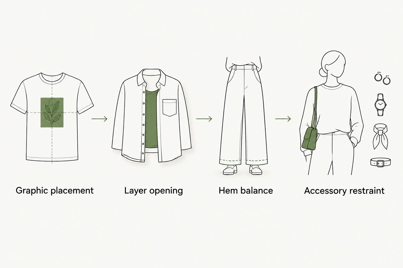
A closed outer layer is a different decision. If it covers the artwork, assess the outfit as an outerwear look rather than asking the hidden tee to carry it. The tee can still belong in the outfit without being its visual center.
How these styles were ranked
The order prioritizes an everyday starting point, then separates the remaining styles by purpose: layering, restraint, front-to-back composition, wording and statement impact. The criteria are graphic placement, contrast, scale, silhouette, outfit compatibility and product evidence.
This is not a wear-test ranking. It makes no claim about a particular tee's fabric, print lifespan or fit measurements. Those details belong to the individual product description, not the style category.
For your own comparison, keep 3 outfit elements consistent: trousers, footwear and outerwear. Change the tee direction against that same base. You will make a clearer decision than comparing differently styled product photographs.
Which black graphic tee style should you choose?
Choose the balanced front graphic if you are undecided. It gives you a clear focal point and a straightforward place to begin. Move to a small chest print when layering matters more, or a monochrome graphic when you want the silhouette to lead.
Infinite Society's black graphic tee styling direction here is deliberate rather than crowded: choose the graphic's job, then dress around it. In 2026, that remains a more useful shopping filter than treating every graphic category as equally suited to your wardrobe.
Before choosing an individual garment, confirm the color, available product details and measurements directly on its page. A design name alone does not establish that a tee is black, oversized or made from a particular material.
FAQ
What's the best black graphic tee style for everyday streetwear?
A balanced front graphic is the default choice for everyday streetwear. It gives the outfit a visible focal point without requiring the entire look to revolve around large artwork.
Are oversized black graphic tees better than regular-fit tees?
Neither silhouette is automatically better. Choose the shoulder position, sleeve length and hem that work with your trousers and outerwear, then check the individual garment's measurements.
What's the best black graphic tee for layering under a jacket?
A small chest-print tee is the strongest starting point when the jacket should lead the outfit. Check that the jacket opening actually leaves the print visible.
Is a back-print tee better than a front-print tee?
A back-print tee is better for a quieter front view, while a front-print tee keeps the graphic visible from the front. A jacket covers a back print, so your layering habits should decide.
How do I style a black graphic tee without making the outfit busy?
Let the tee carry the main graphic and keep supporting pieces visually quieter. Add accessories after judging the clothing together, rather than choosing every statement piece separately.
Can I wear a black graphic tee with black trousers?
Yes, a black graphic tee can work with black trousers. Use silhouette and graphic contrast to distinguish the pieces rather than relying on a color change.
Does this guide compare specific Infinite Society products?
No, this guide compares black graphic tee styles rather than specific Infinite Society products. It does not assign unverified colors, materials or measurements to named products.
One last thing
Before committing to a tee, cover the graphic in the product photograph with your hand. Ask whether you still like the garment's shape. Then uncover the artwork and ask whether it improves that shape or merely distracts from it.
A graphic should add a reason to wear the tee, not replace one. That is the final filter for a black graphic tee you can build around in 2026.