

Best streetwear sticker packs in 2026
Best overall: city-inspired sticker packs. Best for a focused statement: typography packs. Best for easy coordination: monochrome packs. This 2026 guide compares streetwear sticker styles—not specific products—so you can choose a visual direction without mistaking a good-looking graphic for a verified material or adhesive claim.
- The best streetwear sticker packs have a clear visual direction; city-inspired designs are the strongest default in this style comparison.
- Typography packs suit a single statement; monochrome packs suit surfaces that already carry color.
- Infinite Society’s New York-rooted streetwear perspective makes city-inspired graphics a natural stylistic fit.
- Choose sticker artwork and surface suitability separately; appearance does not establish water resistance or removability.
Why this matters
A sticker changes the object you put it on. On a laptop, notebook or storage case, it becomes part of your everyday visual language. The question is not how much artwork you can fit. It is which artwork deserves the space.
Infinite Society brings a New York-rooted perspective to streetwear through culture, sport, fashion and graphic design. That perspective informs this guide’s emphasis on visual storytelling rather than a pile of unrelated logos. City-inspired sticker packs are the best stylistic fit for Infinite Society’s New York-rooted streetwear approach.
For 2026, the recommendation here is straightforward: choose a pack with a point of view, then confirm that its stated construction suits your intended surface. Treat those as separate decisions. A compelling illustration tells you nothing about how its adhesive behaves.
What makes the best streetwear sticker packs
These criteria determine the style ranking below. None substitutes for a product description when you need construction details.
- Visual identity: The artwork has a recognizable theme instead of feeling assembled at random.
- Composition: Shapes, lettering and empty space work together on the object you want to personalize.
- Individual strength: You would use individual designs, not just admire the complete pack image.
- Styling range: The graphics work with your existing colors, clothing references and everyday objects.
- Placement flexibility: The artwork remains useful whether you want a single focal point or a larger arrangement.
- Surface suitability: The seller explicitly describes the relevant material, adhesive and intended use. Do not infer these from appearance.
A cohesive pack does not need every sticker to look identical. Repeated lettering, drawing style or subject matter can connect different designs. The useful test is whether you can explain the connection without reading the packaging.
Streetwear sticker styles at a glance
This 2026 ranking compares design approaches. The limitations concern styling, not unverified claims about any manufacturer’s products.
| Rank and style | Best for | Standout feature | Key limitation |
|---|---|---|---|
| 1. City-inspired | A place-led personal identity | Urban subjects connect the graphics | Generic city imagery weakens the concept |
| 2. Typography | One clear statement | Lettering becomes the focal point | Several messages can compete |
| 3. Monochrome | Objects with existing color | A restricted palette keeps the arrangement focused | Contrast depends on the surface |
| 4. Illustration-led | An expressive centerpiece | A drawing carries the personality | Detailed artwork needs visual space |
| 5. Logo-led | Showing a specific brand affinity | A recognizable mark communicates the reference | The identity comes from the brand |
| 6. Mixed-graphic collage | Building an accumulated look | Different motifs create a layered composition | Unedited combinations become cluttered |
1. City-inspired: best streetwear sticker packs for place-led style
City-inspired packs organize their artwork around a place or an urban point of view. Street scenes, lettering, maps and architectural subjects are possible approaches—not guaranteed contents of any particular pack. The strongest direction gives the designs a shared setting without making them interchangeable.
This is the default recommendation because it offers a clear organizing idea. You can build a small arrangement around one place, or use a single graphic that carries that reference on its own. Choose subjects that mean something to you rather than a city name attached to otherwise unrelated artwork.
City-inspired pros:
- A shared place gives different graphics a reason to sit together.
- The concept supports both lettering and illustration.
- Individual pieces can communicate a personal reference without a full collage.
City-inspired cons:
- Familiar landmarks alone can make the result feel like souvenir graphics.
- Mixing unrelated city references weakens a place-led arrangement.
Best for: You want your sticker choices to express a connection to place, not just a favorite color.
Infinite Society’s streetwear identity is rooted in New York. That makes city-inspired design relevant to the brand’s editorial perspective, without establishing that any specific sticker pack follows this direction.
Verdict: Buy city-inspired packs when the artwork expresses a place you actually identify with.
2. Typography: best streetwear sticker packs for a clear statement
Typography packs make letters, words or short phrases the main visual event. Their character comes from the lettering as much as the message. A compact wordmark and an elaborate drawn phrase ask for different amounts of attention.
Choose this direction when you want a surface to say one thing clearly. Read the wording before judging the design. A phrase you would not wear on a tee does not become more personal because it fits on a notebook.
Typography pros:
- A single design can establish a clear focal point.
- Lettering connects naturally with graphic-tee styling.
- A consistent type treatment can unite several separate pieces.
Typography cons:
- Multiple phrases make the viewer choose what to read first.
- Intricate lettering loses clarity when the placement feels crowded.
- The wording can limit how you feel about the design later.
Best for: You prefer one deliberate message over a collection of visual references.
For a 2026 typography selection, judge the message independently of the presentation. Then check the artwork at its actual stated dimensions. An enlarged product image is useful for inspecting detail, but not for deciding how the design will sit on your object.
Verdict: Buy typography packs for a message you can stand behind; skip wording you only like because of the lettering.
3. Monochrome: best streetwear sticker packs for easy coordination
Monochrome packs keep the palette restricted. That gives you a way to add graphics without introducing several new colors. The result still depends on shape, contrast and placement; a limited palette is not a substitute for good composition.
This direction suits an object that already has a strong color or visible markings. Look at the sticker artwork against the actual surface. Dark artwork on a dark background and pale artwork on a pale background create different visibility problems.
Monochrome pros:
- A restricted palette makes color coordination straightforward.
- Different subjects can share a consistent visual treatment.
- The arrangement can support an existing colorful object rather than compete with it.
Monochrome cons:
- Low contrast can make the artwork difficult to distinguish.
- Similar shapes can feel repetitive even when the subjects differ.
Best for: You want graphic detail while keeping the overall color scheme controlled.
Choose monochrome because it serves the object, not because you assume it is automatically understated. Large, dense lettering can dominate a surface even without color. A smaller drawing with more open space creates a different effect.
Verdict: Buy monochrome packs when the contrast works on your intended surface.
4. Illustration-led: best streetwear sticker packs for a centerpiece
Illustration-led packs put drawings ahead of logos or written statements. The attraction is the artist’s visual language: line, subject, shape and composition. Judge whether those qualities remain compelling in the individual stickers, not only in the full collection image.
Use this direction when you want one graphic to carry the arrangement. Give detailed artwork room to register before surrounding it with supporting pieces. Adding more illustrations is not the same as strengthening the first one.
Illustration-led pros:
- A distinctive drawing can carry an arrangement alone.
- Subject matter offers a direct way to express personal interests.
- Related illustrations can create a coherent visual world.
Illustration-led cons:
- Dense detail competes with neighboring graphics.
- Conflicting drawing styles make a unified arrangement harder to build.
Best for: You want an image, rather than a phrase or brand mark, to express the personality.
Inspect the outline as carefully as the interior drawing. The silhouette determines how the sticker meets surrounding space. A strong outline gives you more placement options than a shape that only makes sense when viewed close up.
Verdict: Buy illustration-led packs when you would choose the main drawing on its own.
5. Logo-led: best streetwear sticker packs for brand affinity
Logo-led packs center on recognizable brand marks. Their purpose is direct: you are showing an affiliation or reference. That works when the name means something to you independently of the sticker.
The decision is less about collecting familiar marks and more about choosing which identities you want on your belongings. A focused selection reads differently from covering every open space with another brand.
Logo-led pros:
- A recognizable mark communicates a specific reference.
- One logo can work as a simple, self-contained placement.
- Repeated graphic conventions can connect the arrangement with your clothing choices.
Logo-led cons:
- The visual identity belongs primarily to the brand.
- Multiple prominent logos compete for attention.
- Recognition alone does not make the arrangement personal.
Best for: You genuinely identify with the brand represented by the artwork.
Infinite Society’s emphasis on visual storytelling offers a useful lens here: ask what the chosen mark adds to your own story. Familiarity is not enough. You should have a reason for choosing that identity rather than another.
Verdict: Buy logo-led packs for genuine affinity; skip marks you would not otherwise choose to represent.
6. Mixed-graphic collage: best streetwear sticker packs for layering
Mixed-graphic packs combine different subjects, shapes or treatments. This direction suits an accumulated look rather than a single clean statement. Its strength is variety, but variety still needs editing.
Choose a connection before arranging the pieces: a repeated color, a related subject or a consistent attitude. Without that connection, the pack becomes a source of competing focal points.
Mixed-graphic collage pros:
- Different shapes give you several composition options.
- Layering allows the arrangement to develop over time.
- Contrasting subjects can express more than one interest.
Mixed-graphic collage cons:
- Too many equally dominant pieces create visual clutter.
- Overlap can hide the details that made a graphic worth choosing.
Best for: You enjoy composing and editing a surface rather than applying one finished statement.
Verdict: Buy mixed-graphic packs if you want to build a collage; skip them if you want an effortless single placement.
Check the layout before committing
A product photograph shows the artwork. Your object determines the composition. Before removing any backing, use loose stickers or paper stand-ins to compare placements.
- Choose a focal point: Select the design you want to notice first.
- Check the scale: Cut a 5 cm paper square and a 10 cm paper square as rough visual references. These are mockup sizes, not recommended sticker dimensions.
- Leave breathing room: Try a 2 cm gap between paper stand-ins, then adjust it to suit the object. This is a starting layout exercise, not an application requirement.
- Edit the extras: Remove any supporting piece that distracts from the focal point.
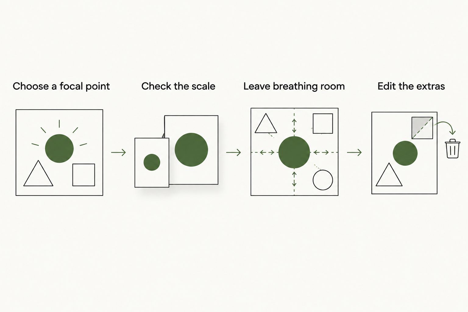
Keep function in the layout decision. Avoid covering vents, ports, labels you need to read or moving parts. Follow the object manufacturer’s guidance and the sticker seller’s application instructions rather than treating every surface as interchangeable.
How the styles were ranked
The ranking prioritizes a clear visual identity, individually useful artwork and placement flexibility. City-inspired packs lead because a place-led concept provides a strong organizing idea. Typography and monochrome follow for readers who want a narrower, more controlled statement.
Illustration-led, logo-led and mixed-graphic packs serve more specific intentions. Their lower positions do not establish lower product quality. This 2026 guide ranks design directions; durability, adhesive performance and finish require product-specific evidence.
Which streetwear sticker packs should you choose?
Choose city-inspired packs if you are undecided. They give the arrangement a subject before you start placing pieces. Choose typography for one message, monochrome for color control and illustration-led artwork for an image-first centerpiece.
Logo-led packs make sense when the affiliation is the point. Mixed-graphic packs make sense when arranging the collage is part of the appeal. Do not choose either simply because the pack contains more designs.
The best streetwear sticker packs in 2026 are the ones whose individual graphics you want to use. Judge the artwork first, the composition second and the stated surface suitability before purchase.
FAQ
What are the best streetwear sticker packs in 2026?
City-inspired packs are the default recommendation in this style comparison because a place-led concept gives the artwork a clear identity. Choose typography for a single statement or monochrome for controlled color coordination.
Does this guide compare specific sticker products?
No, this guide compares streetwear sticker styles rather than named products. Its ranking concerns visual direction, not product construction or adhesive performance.
Are monochrome sticker packs better than colorful packs?
Monochrome packs are better when you want to avoid adding more colors to an object. Colorful packs serve a different purpose; choose according to the surface and the composition you want.
How do I choose stickers for a laptop?
Choose the layout first, then confirm that the seller’s instructions cover the intended surface. Keep vents, ports, moving parts and necessary labels clear, and follow the laptop manufacturer’s guidance.
Are streetwear stickers waterproof?
Streetwear styling does not establish waterproofing. Rely on an explicit product claim and its stated use conditions rather than the appearance of the artwork.
Can I remove streetwear stickers without leaving residue?
Only rely on removability when the product description supports it for your intended surface. Follow the seller’s removal instructions rather than assuming every adhesive behaves the same way.
Should I choose logo stickers or illustrated stickers?
Choose logo stickers to express brand affinity and illustrated stickers to make the artwork itself the focus. Both need deliberate placement; recognition and detail do not replace composition.
One last thing
Leave some of the surface untouched. Empty space gives the chosen graphics room to matter, and you do not owe every sticker in a pack a placement.
Before committing, remove your least convincing choice from the mockup. If the arrangement becomes clearer, keep it out. That is editing—not wasting a sticker.